

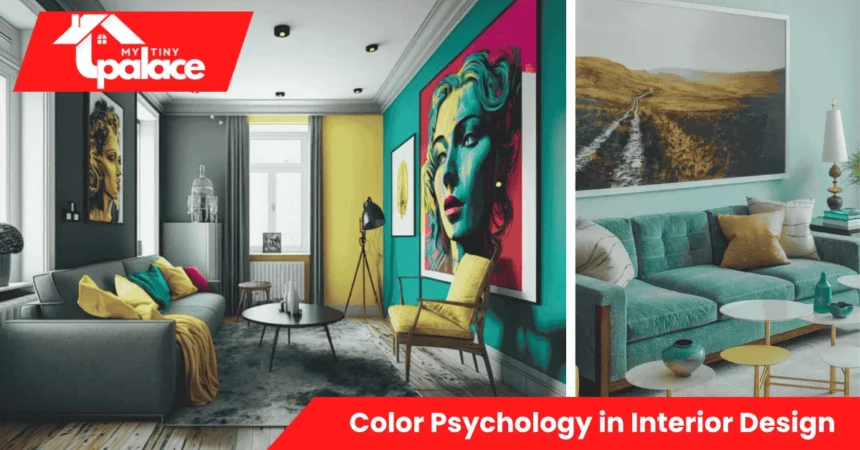
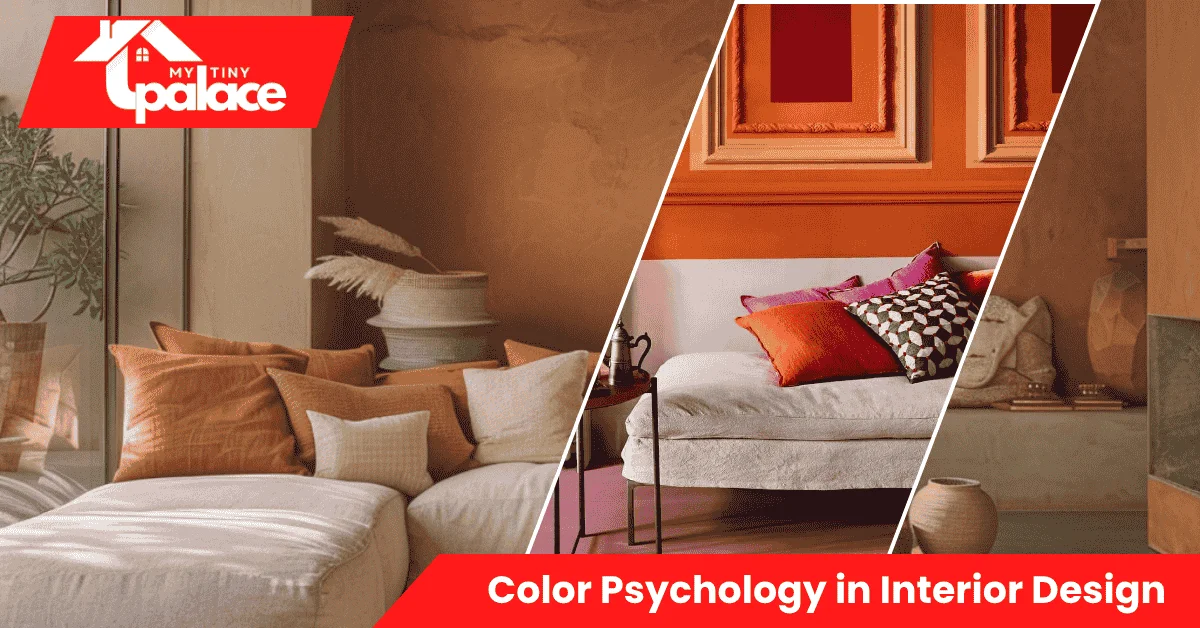
Walk into a room painted soft blue, and you feel calm. Step into a space with bright yellow walls and suddenly you’re more alert. That’s not a coincidence—it’s color psychology at work. Your wall colors directly affect how you feel, how productive you are, and even how large your rooms appear. This guide shows you exactly how to choose colors that match the mood you want in each space, plus simple ways to test options before you commit.
- Quick summary
- What is Color Psychology in Interior Design?
- Why color choices matter at home
- Choosing the right color palette (core solution)
- Room-by-room color guide
- How to test and apply colors
- Costs, time, tools — include a small table
- Pros & cons / who should consider it
- Quick summary + CTA (what to do next)
Quick summary
Color psychology in interior design uses specific hues to influence mood and perception in your home. This article walks you through choosing palettes based on desired feelings, testing paint samples properly, and applying room-specific strategies—including renter-friendly swaps that require zero permanent changes. You’ll learn a simple decision framework, realistic cost estimates, and actionable steps you can start this weekend.
What is Color Psychology in Interior Design?
Color psychology in interior design is the practice of selecting wall colors, accent tones, and decor hues based on how they affect human emotion and behavior. Different colors trigger different responses: blue typically lowers heart rate and promotes calm, while yellow stimulates mental activity and cheerfulness. The effect comes from three main factors—hue (the actual color family), saturation (how pure or muted it is), and brightness (how much light it reflects). Undertones matter too: a blue with gray undertones feels cooler and more formal than one with green undertones, which reads warmer and cozier. Understanding these basics lets you shape the atmosphere of any room intentionally rather than guessing.
Why color choices matter at home
The colors you pick influence far more than aesthetics. Warm tones like terracotta or peach make a room feel cozy but can also make it feel smaller, while cool tones like pale gray or soft green visually expand space by reflecting more light. Color impacts productivity—studies show cooler blues and greens help focus in home offices, while warmer reds and oranges can increase appetite in dining areas. Sleep quality changes with bedroom color: softer, low-saturation blues and greens encourage relaxation, whereas bright or highly saturated walls can delay sleep onset. Even safety matters—poor color contrast on stairs or between walls and trim can create trip hazards for older adults or anyone with vision challenges. When you match color to function, you create spaces that genuinely support how you live.
Choosing the right color palette (core solution)
Start by defining the mood you want. Ask yourself: should this room energize me, calm me, or help me concentrate? Once you know the feeling, pick a base color that delivers it—soft blue for calm, warm beige for comfort, muted green for focus. Next, check your natural light. North-facing rooms get cooler, bluer light all day, so warm colors balance that chill. South-facing rooms flood with warm light, making cool colors feel less stark. Consider fixed elements you can’t easily change: wood floors, tile backsplashes, cabinet finishes. Your wall color should complement these, not fight them.
Choose one or two accent colors to add depth—these go on a single feature wall, in textiles, or through decor. Test undertones by holding paint chips against your flooring and furniture in actual room lighting. A beige that looks warm in the store might turn pink or peach on your wall if it has the wrong undertone. For renters or anyone avoiding commitment, stick with neutral bases and bring in color through removable wallpaper, large rugs, curtains, or throw pillows. Small spaces benefit from low-saturation tones in the same color family—think pale sage to medium sage rather than jumping from white to forest green, which chops up the visual flow and makes rooms feel smaller.

Room-by-room color guide
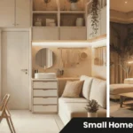
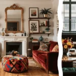
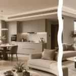
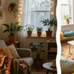
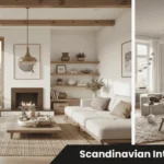
In living rooms, aim for welcoming warmth or calm neutrality, depending on use. Soft grays, warm taupes, and muted blues work well because they pair easily with varied furniture styles and don’t overwhelm guests. If your living room gets evening use for relaxation, avoid overly bright or saturated colors that keep energy high. Bedrooms need colors that support rest: cool blues, soft greens, and pale lavenders reduce stimulation. Skip red, bright orange, or intense yellow—they’re too energizing for sleep. One common mistake is choosing a color you love in small doses, like deep navy, then painting all four walls and feeling trapped. Test darker shades on just one accent wall first.
Kitchens benefit from colors that feel clean and stimulating. Whites, light grays, and soft yellows reflect light well and make the space feel larger, which matters since kitchens often lack big windows. Warm tones can increase appetite—useful in family kitchens but potentially problematic if you’re watching portions. Bathrooms do well with spa-like cool tones—pale aqua, soft gray-blue, or clean white—that enhance the feeling of cleanliness. Avoid warm yellows or beiges in windowless bathrooms; they can look dingy under artificial light.
Quick room examples
A bedroom painted soft sage green with white trim creates instant calm and pairs with natural wood furniture for a grounded, restful feel. A home office in muted blue-gray boosts focus without feeling cold, especially when balanced with warm wood desk surfaces.
How to test and apply colors
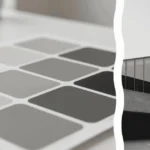
Order sample pots or large swatches from your paint store—you need at least three shades in the range you’re considering. Paint 12×12-inch patches directly on your wall in different areas of the room, not on poster board. Poster board doesn’t show how the color interacts with your actual wall texture and existing light. View your samples at three different times: morning, midday, and evening. Natural light changes color dramatically throughout the day. Take photos under your room’s artificial lighting too—LED bulbs cast a different tone than incandescent, and that affects how paint reads at night.
Related Articles

Live with your test patches for at least 48 hours. What feels fresh on day one might feel too intense by day three. If you’re renting, test on large foam boards you can prop against walls, or use peel-and-stick sample squares available at most paint retailers. These let you experiment without losing your security deposit. When you’re ready to paint, prep matters: clean walls, fill holes, apply primer if you’re going from dark to light or covering stains. One gallon covers about 350 square feet, so measure your room before buying. Most spaces need two coats for even coverage.
Quick test steps
- Buy sample pots in three shades of your chosen color
- Paint 12×12-inch test squares on different walls
- View samples morning, afternoon, and evening for two days
- Photograph under your room’s artificial lights
- Choose the shade that feels right in all lighting conditions
- Calculate square footage and buy enough paint plus 10% extra
Costs, time, tools — include a small table
Testing paint costs $5–$15 per sample pot, and you’ll need at least three samples. A DIY repaint of one average bedroom takes a weekend and runs $50–$150 for paint, primer, brushes, rollers, and tape. Hiring a professional painter costs $300–$800 for a single room, depending on size, prep work, and your location. Tools you’ll need: painter’s tape, drop cloths, roller and tray, angled brush for edges, and a stir stick.
| Task | Cost Range | Time Required |
|---|---|---|
| Sample testing | $15–$45 | 2–3 days |
| DIY one room | $50–$150 | 1–2 days |
| Hire professional | $300–$800 | 4–8 hours |
Pros & cons / who should consider it
Using interior color psychology gives you mood control in every room and can boost resale appeal—neutral, well-chosen palettes help buyers imagine themselves in your space. Downsides include time investment for proper testing, commitment once you paint, and the risk of undertone mistakes that make a color look wrong after it dries. Renters benefit most from non-permanent color swaps, such as textiles and removable wallpaper. Homeowners gain long-term atmosphere improvements. Sellers should stick to neutral, broadly appealing shades that don’t alienate buyers. If you’re planning structural changes like removing walls or adding windows, consult a licensed contractor before painting—color choices might shift once your lighting and layout change.
Quick summary + CTA (what to do next)
Pick the mood first—color follows. Decide whether you want calm, energy, or focus in your space, then choose a base color and one accent. Order three sample pots this week and paint test patches on your walls. View them at different times of day for 48 hours, then commit to the shade that feels right in all lighting conditions. Start with one small room or a single accent wall this weekend. You’ll see the difference color psychology makes the moment you walk in.